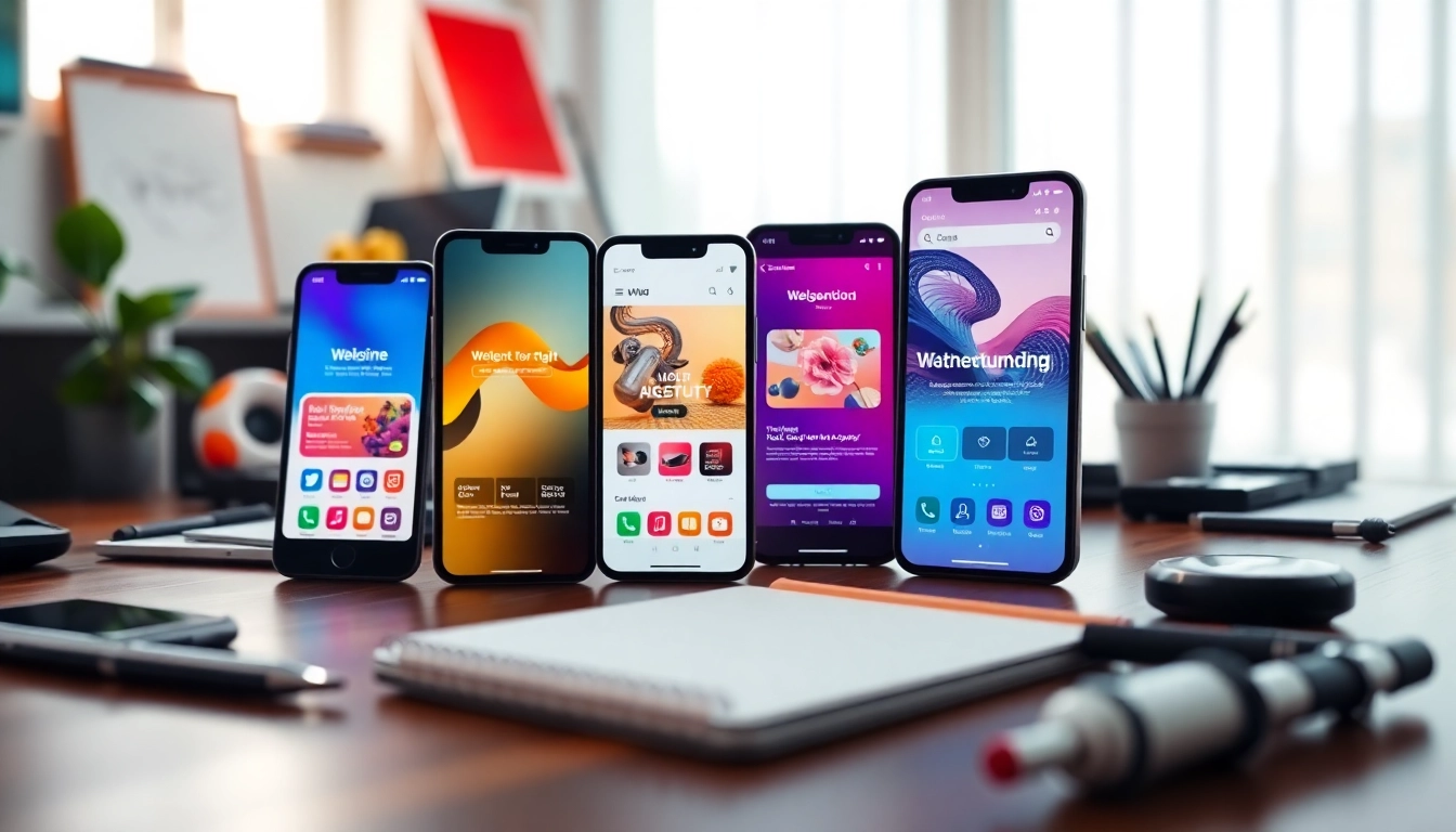
Understanding Mobile View
Definition of Mobile View
Mobile view refers to the specific layout and design of a website or application as it is displayed on mobile devices, such as smartphones and tablets. This adaptation takes into account the smaller screen size and touch functionality inherent to these devices. The goal of a mobile view is to provide a seamless browsing experience that facilitates easy navigation, readability, and interaction without requiring the user to zoom or scroll excessively.
Importance of Mobile Compatibility
With a growing percentage of internet traffic coming from mobile devices, ensuring that a website is mobile-compatible is paramount. Websites that aren't optimized for mobile can lead to high bounce rates as users struggle to access content. Furthermore, search engines have begun prioritizing mobile-friendly sites in their rankings, making it essential for businesses to adopt responsive web design. In fact, a well-designed mobile view can markedly improve a website's search engine optimization (SEO) performance and overall visibility online.
How Mobile View Differs from Desktop View
The primary difference between mobile view and desktop view lies in the layout and usability tailored for different devices. Mobile views typically arrange content in single-column formats, making it easier to read without horizontal scrolling. Elements such as buttons and links are designed to be larger in mobile view for effortless tapping. In contrast, desktop views often utilize multi-column layouts, which can display more information at once but complicate navigation on touch-based devices. Overall, providing a unique mobile experience is imperative for user retention and engagement.
Benefits of Optimizing Mobile View
Improved User Experience
Enhancing the mobile view improves the user experience significantly. When users can easily navigate a site without frustration, it leads to increased satisfaction, longer visit durations, and, ultimately, greater conversion potential. An optimized mobile experience addresses user pain points such as slow loading times, unresponsive elements, and complex navigation paths, fostering a positive impression of the brand and increasing loyalty.
Enhanced SEO Performance
Mobile compatibility is a significant factor in search engine rankings. Google has adopted a mobile-first indexing approach, meaning it predominantly uses mobile versions of content for indexing and ranking. Therefore, websites optimized for mobile view are more likely to rank higher on search results. This emphasizes the need for adaptive designs that not only focus on aesthetics but also on site speed and usability metrics to enhance SEO.
Increased Engagement Rates
When sites are optimized for mobile view, users are more likely to engage with the content. Optimized designs minimize the barriers to interaction—be it commenting, sharing, or purchasing—supporting higher engagement rates. Offering users quick, intuitive navigation paths can result in more clicks, more time spent on the site, and ultimately, increased sales or leads.
Best Practices for Designing Mobile View
Responsive Design Principles
Responsive web design is a foundational practice for creating effective mobile views. This involves using flexible grids and layouts, fluid images, and CSS media queries to adapt the content dynamically to various screen sizes. Adopting a mobile-first approach—that is, designing for mobile before scaling up for desktops—can ensure that all elements are user-friendly on smaller devices.
Loading Time Optimization
The loading time of a mobile page is critical. Research indicates that 53% of mobile users abandon sites that take longer than three seconds to load. Employing techniques such as compressing images, minimizing JavaScript, and leveraging content delivery networks (CDNs) can significantly enhance page speed. Furthermore, regular performance testing should be conducted to ensure optimal loading times across various mobile networks.
Touchscreen-Friendly Features
Designing elements with touch functionality in mind is crucial for an effective mobile view. Buttons should be large enough to tap easily without accidental clicks, and spaces between clickable items must be adequately spaced to avoid frustration. Additionally, utilizing gestures like swiping can further enhance user interactions. Consistent testing with real users assists in fine-tuning these features, leading to a more engaging mobile experience.
Testing Your Mobile View
Tools for Mobile View Testing
To ensure that the mobile view is functioning as intended, numerous testing tools are available. Platforms such as BrowserStack, Google Mobile-Friendly Test, and the aforementioned mobile view website checker can simulate various devices and screen sizes, allowing developers to evaluate performance and usability.Conduct regular assessments using these tools to identify areas for improvement.
Common Issues and Fixes
Mobile optimization is not without its challenges. Common issues include broken links, improperly scaled images, and poor navigation. Fixes for these problems typically involve thorough QA testing across devices, employing automated tools to detect issues, and iterating on design based on user feedback. Tracking analytics can also provide data on user behavior, helping to pinpoint specific areas that require attention.
Feedback and Iteration Process
Feedback from users is invaluable in the optimization process. Utilizing user testing sessions and analytic tools can provide insights about how visitors interact with the mobile view. Continuous iterations based on this feedback can lead to a more user-focused design, optimizing the overall mobile experience and addressing user needs effectively.
Future Trends in Mobile View Technology
Emerging Technologies Impacting Mobile View
The future of mobile view optimization will likely be shaped by emerging technologies such as AI and machine learning. These technologies can analyze user behaviors and provide insights that help in customizing user experiences. Additionally, advancements in voice search and augmented reality (AR) are setting new expectations for user interaction, necessitating adjustments in mobile design practices.
Predictions for Mobile User Behavior
As technology advances, predictions suggest that mobile users will favor more personalized experiences. AI-driven content recommendations based on individual browsing habits will likely become commonplace. Moreover, the use of increasingly sophisticated e-commerce functionalities—like one-click purchasing or augmented reality previews—will change how brands interact with their mobile audience. Adapting to these trends early can provide businesses with a competitive edge.
Adapting to Changing Trends
Staying ahead of mobile trends requires continual adaptation. Organizations must be flexible in their design strategies and willing to incorporate new ideas as they emerge. Regular audits of mobile performance, consumer feedback, and technological developments should influence design direction, fostering an environment of innovation and responsiveness.
Frequently Asked Questions
What is the mobile view?
The mobile view refers to a version of a website optimized for mobile devices, providing an experience tailored to smaller screens and touch interactions.
How do I get to mobile view?
To enter mobile view on Chrome, right-click the webpage, select 'Inspect', and then click the 'Toggle Device Toolbar' icon to simulate a mobile device screen.
Why is mobile optimization necessary?
With most web traffic coming from mobile devices, optimization ensures accessibility and superior user experience, which can enhance SEO rankings and user retention rates.
What are the benefits of responsive design?
Responsive design allows a website to adjust to multiple screen sizes, ensuring users have an optimal experience on any device, which can boost engagement and conversion rates.
How can I test my mobile view?
Use tools like Google Mobile-Friendly Test or BrowserStack to evaluate how your website appears on various devices, simulating real user experiences for troubleshooting.